Imagine walking into a daycare with a bland, confusing, or overly complicated logo. Would you feel confident leaving your child there? A daycare logo is more than just a symbol—it’s a representation of trust, warmth, and care. Yet, many daycare owners make critical mistakes when designing their logos, ultimately hurting their brand.
In this guide, we’ll explore five common daycare logo mistakes and how to avoid them. Plus, we’ll discuss the best fonts and colors to use to create a warm, inviting, and memorable brand identity.
Table of Contents
- Choosing the Wrong Colors
- Using Overly Complex Designs
- Selecting the Wrong Fonts
- Ignoring Scalability and Versatility
- Not Hiring a Professional Designer
- Need Help? Contact a Professional Logo Designer
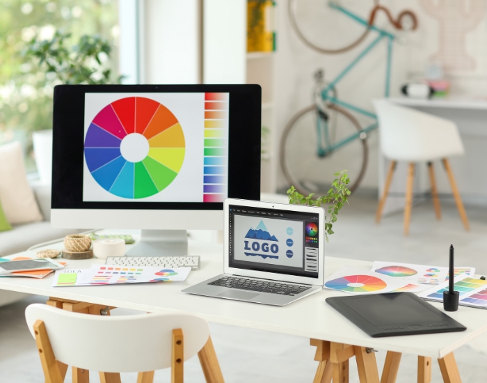
Choosing the Wrong Colors
Your logo’s color palette plays a huge role in the message your daycare brand conveys. Using the wrong colors can create the wrong impression or fail to appeal to parents.
Best Color Choices for Daycare Logos:
- Bright, Warm Colors (Yellow, Orange, Light Green): These colors evoke happiness, playfulness, and warmth, making them ideal for a daycare setting.
- Soft Pastels (Sky Blue, Soft Pink, Lavender): These colors create a gentle and nurturing atmosphere.
- Avoid Dark or Dull Colors: Colors like black, dark brown, or gray can feel too serious and uninviting.
Using Overly Complex Designs
Some daycare owners try to cram too many elements into their logo—multiple characters, detailed illustrations, and excessive text. While creativity is great, an overly complex logo can make it hard to recognize and remember.
Tips for Simplicity:
- Stick to 1-2 key elements that represent your daycare.
- Make sure the design looks good even in black and white.
- Avoid cluttered designs that don’t scale well.
Selecting the Wrong Fonts
Fonts can make or break your logo. A font that’s too serious or hard to read may not attract parents.
Best Font Choices for Daycare Logos:
- Rounded, Playful Fonts (Comic Sans, Poppins, Baloo): These convey a friendly and fun vibe.
- Soft, Handwritten Fonts (Pacifico, Amatic SC): These feel warm and inviting.
- Avoid Sharp, Harsh Fonts: Stay away from fonts that look too corporate or formal.
Ignoring Scalability and Versatility
A great daycare logo should look good on different platforms—business cards, websites, signage, and even t-shirts. If your logo loses clarity when resized, it won’t be effective.
What to Keep in Mind:
- Test your logo at different sizes.
- Ensure it looks good in black and white as well as in color.
- Use vector-based designs for better scalability.
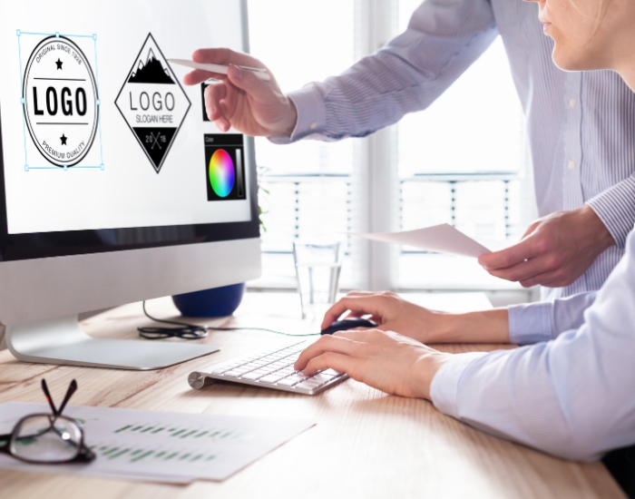
Not Hiring a Professional Designer
Many daycare owners try to design their logos themselves or use cheap online generators. While this may seem cost-effective, it often results in generic or low-quality logos that fail to stand out.
Why Work with a Professional?
- A day care logo designer in Dallas will create a custom, high-quality logo tailored to your brand.
- A logo designer near me can provide expert guidance on colors, fonts, and scalability.
- A logo design company near me ensures your logo is unique and legally protected.
Need Help? Contact a Professional Logo Designer
Your daycare logo is a vital part of your brand identity. Avoid these common mistakes and invest in a design that builds trust with parents.
If you need a professional day care logo designer in Dallas, contact Logo Design Dallas today! Our team specializes in creating fun, engaging, and memorable daycare logos that parents will love.