The Power of Colors on the Color Wheel in Eye-Catching Logos
Color isn’t just decoration—it’s communication. For logo designers, understanding the colors on the color wheel is essential for making designs that not only look good but feel right. From global brands to local startups, the power of color plays a huge role in building trust, evoking emotion, and standing out in the crowd.
In this guide, we’ll explore how the color wheel, color theory, and smart branding choices create unforgettable logos. We’ll also break down famous examples, HTML color codes, and how professional designers use opposite colors on the color wheel for powerful impact.
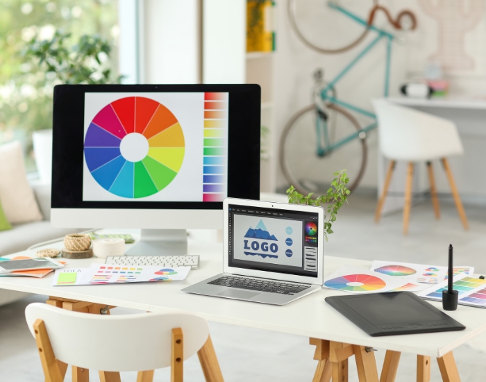
A Quick Look at the Colors on the Color Wheel
The traditional color wheel used across the U.S. design and art industries includes:
Primary Colors (cannot be made by mixing other colors):
-
Red
-
Blue
-
Yellow
Secondary Colors (created by mixing two primary colors):
-
Green = Blue + Yellow
-
Orange = Red + Yellow
-
Purple = Red + Blue
Tertiary Colors (mixing primary with secondary colors):
-
Red-orange, Yellow-orange, Yellow-green, Blue-green, Blue-purple, Red-purple
Understanding the colors on the color wheel helps designers create balanced color palettes, avoid clashing tones, and use contrast to highlight key elements in logos. This is what separates a good design from a memorable one.
For example, blue and orange are opposite colors on the color wheel. When used together, they create a striking visual balance—like you’ll see in the Firefox or Fanta logos.
Dallas Color Scheme (Modern & Western Blend)
Recommended Colors:
-
Steel Gray (#708090) – urban sophistication, modern Dallas
-
Crisp Red (#C8102E) – bold, finance and business hub energy
-
Neutral Tan (#D2B48C) – western heritage, ranchland roots
Color Wheel Pairing: Use complementary pairs like red and green, or triadic harmony with red, blue, and yellow for a vibrant, confident look.
Fort Worth Color Palette – Western & Rustic
Fort Worth is known as “Where the West Begins.” It embraces heritage, cowboy culture, and earthy aesthetics.
| Color | HEX | Vibe/Meaning |
|---|---|---|
| Saddle Brown | #8B4513 |
Leather, cowboy boots, rustic charm |
| Dusty Beige | #D2B48C |
Ranchlands, warmth, tradition |
| Deep Olive | #556B2F |
Stability, agriculture, natural tone |
🎨 Color Wheel Strategy: Use analogous earthy tones like brown, beige, and olive for a cohesive, traditional look.
How Big Brands Use the Colors on the Color Wheel
Let’s look at real examples of global brands that strategically apply colors on the color wheel in their logos:
-
Coca-Cola uses a classic primary color, red (#E41A1C), to represent energy, passion, and excitement.
-
IKEA pairs blue (#0051BA) and yellow (#FFD700)—a bold combo of opposite colors on the color wheel that feels trustworthy yet fun.
-
Starbucks uses green (#00704A), which symbolizes freshness, balance, and calmness.
-
FedEx brilliantly combines purple and orange for a modern, high-contrast look.
-
Google features multiple primary and secondary colors, signaling diversity and approachability.
These companies didn’t just guess their color choices—they used color theory to create powerful emotional connections.
HTML Color Codes You Should Know
Here’s a quick reference for the most-used design shades on the colour of colours chart:
| Color | HEX Code | Emotional Vibe |
|---|---|---|
| Red | #FF0000 | Bold, energetic, urgent |
| Blue | #0000FF | Trustworthy, calm, strong |
| Green | #008000 | Natural, healthy, stable |
| Yellow | #FFFF00 | Cheerful, youthful, happy |
| Orange | #FFA500 | Friendly, energetic, warm |
| Purple | #800080 | Creative, luxurious, bold |
Pairing these colours colour wheel tones properly is key to branding success.
Pairing these colors on the color wheel properly is essential for branding success. Just look at Amazon—its logo features a sleek black font with a vibrant orange arrow (HEX #FFA500) that points from A to Z. That friendly orange tone was chosen to evoke approachability, warmth, and customer satisfaction. Over time, this color pairing became iconic—subtly blending professionalism with a playful promise of convenience.
Walmart, on the other hand, chose a calming shade of blue (HEX #0071CE) for trust and dependability, paired with a yellow sunburst (HEX #FDD835) that conveys optimism and positivity. This combination reflects Walmart’s brand promise: low prices, friendly service, and a sunny shopping experience for families.
Both logos show how even subtle use of colors on the color wheel—paired intentionally using color theory—can shape how the world sees your brand. These aren’t just colors; they’re emotional triggers that inspire trust, happiness, and loyalty.
The Story Behind Amazon’s Logo Color and HTML Code
Choosing the right color isn’t just about what looks good—it’s about what feels right to your audience. Colors have power, and when used with strategy, they shape the emotional experience people have with your brand. Designers often rely on the colors on the color wheel to guide these decisions, pairing tones that trigger the right response. Here’s a quick look at some of the most commonly used branding shades, along with their HEX codes and emotional associations:
| Color | HEX Code | Emotional Vibe |
|---|---|---|
| Red | #FF0000 | Bold, energetic, urgent |
| Blue | #0000FF | Trustworthy, calm, strong |
| Green | #008000 | Natural, healthy, stable |
| Yellow | #FFFF00 | Cheerful, youthful, happy |
| Orange | #FFA500 | Friendly, energetic, warm |
| Purple | #800080 | Creative, luxurious, bold |
Pairing these colors on the color wheel correctly is essential for impactful design. A perfect example? Amazon. Its current logo, launched in 2000 and designed by Turner Duckworth, is a brilliant case study in emotional branding. The logo features a bold black typeface complemented by a curved orange arrow (HEX #FFA500) stretching from the letter “a” to “z.” This design isn't just visually balanced—it’s filled with meaning. The arrow signifies that Amazon offers everything from A to Z, while also resembling a subtle smile that suggests satisfaction and positivity.
The choice of orange wasn’t random. On the color wheel, orange lies between the urgency of red and the happiness of yellow. It delivers warmth, friendliness, and excitement—qualities Amazon wants customers to feel when engaging with the brand. That arrow color, lifted directly from the colour of colours theory, creates emotional impact without shouting. Meanwhile, the black logotype adds strength and contrast, keeping the design grounded and trustworthy.
Amazon’s use of colors on the color wheel is a masterclass in visual storytelling. It’s a simple logo, yet powerfully effective—proof that when branding is built on clear strategy, emotional color theory, and user-centered design, it becomes timeless. Over two decades later, the logo remains virtually unchanged, which speaks volumes: good color choices never go out of style.
Why Opposite Colors on the Color Wheel Work So Well
When you use opposite colors on the color wheel (also called complementary colors), your logo gets more contrast, energy, and visibility. For example:
-
FedEx: Orange and purple
-
Visa: Blue and yellow
-
Mountain Dew: Green and red
These color pairs create tension—and tension creates attention.
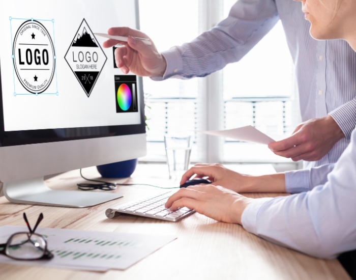
Designers Love the Colors on the Color Wheel (And So Should You)
At Logo Design Dallas, we build every logo from scratch—by hand—not using AI. And one of the first things we reach for is the color wheel theory. We carefully pick your palette based on your industry, your goals, and how you want people to feel when they see your brand.
And yes, we’ll refer to the colors on the color wheel multiple times to get it just right.
Whether you’re after a bold, high-energy look or something more subtle and serene, your color choices will shape your identity—and your customers’ first impressions.
Final Thoughts: Let the Colors Speak for You
The colors on the color wheel aren’t just tools—they’re a language. And at Logo Design Dallas, we speak it fluently. Whether you're launching a new brand or revamping an old one, let’s find the colors that speak your story. Need a logo today? Contact us for same-day custom logo design dallas—built by real designers, based on real color theory, and crafted to turn heads.